

Background
What sparks would the fusion of the Chinese herbal tea, leungcha, and the western daily essential, coffee, make? South Herbal Lab, a cafe derived from the professional Chinese herbal tea brand Wing Sang Tong, creatively fuses leungcha with coffee to promote the traditional Chinese herbal tea to younger generations.
What sparks would the fusion of the Chinese herbal tea, leungcha, and the western daily essential, coffee, make? South Herbal Lab, a cafe derived from the professional Chinese herbal tea brand Wing Sang Tong, creatively fuses leungcha with coffee to promote the traditional Chinese herbal tea to younger generations.
The rationale for the ‘South’ in the brand name comes from its Cantonese pronunciation ‘Nam,’ for it is in the name of the owner’s father, recalling the tight family bonding found in family-run Chinese herbal tea businesses in the old days. Also, ‘South’ represents the Hong Kong orientation in the world, accentuating the brand’s strong sense of belonging to the place.
Design Solution
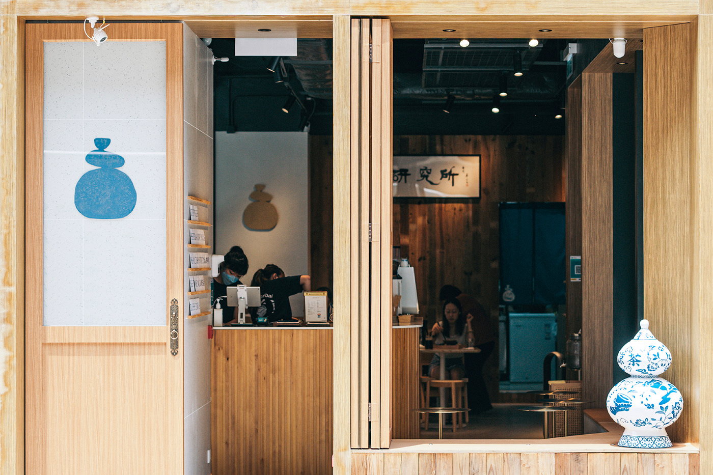
For South Herbal Lab, a leungcha-coffee cafe already so unorthodox, VINCDESIGN decided on a logo that preserves tradition. Inspired by the historical blue-and-white ceramic drinking bowls in traditional Chinese herbal tea places, blue, which is also homophonic with ‘South’ in Cantonese, naturally makes up the colour palette.
For South Herbal Lab, a leungcha-coffee cafe already so unorthodox, VINCDESIGN decided on a logo that preserves tradition. Inspired by the historical blue-and-white ceramic drinking bowls in traditional Chinese herbal tea places, blue, which is also homophonic with ‘South’ in Cantonese, naturally makes up the colour palette.
The logo embodies the shop’s signature blue-and-white Wu Lou and balancing stones, topped off with drinking bowls to echo the Chinese herbal tea customs. The philosophy of balancing stones is that each stack has their own alignments, just like how everyone has their own routines in achieving equilibrium in life. By introducing Chinese herbal tea to balancing stones in the logo, it visualises South Herbal Lab’s mission of bringing balance to customers’ lives with the fusion of leungcha and coffee.
Although South Herbal Lab has an earthy and calming interior decorated with woods that matches its visual identity system of leungcha and balancing stones, the brand required more to change the stereotypical old-fashioned impression of Chinese herbal tea. Hence, the blue-and-white Wu Lou, the blue-and-white tableware, the dragon claw merch, the hidden messages in mug bottoms, and the modern Chinese calligraphy are all insta-worthy hotspots that capture the attention of the younger generations, allowing South Herbal Lab to promote Chinese herbal tea in a cafe.


Branding & package design for SOUTH HERBAL LAB 南本草
Client/Project: SOUTH HERBAL BAL 南本草
Creative Director: Vince Cheung
Design and illustration: Kaman Kan & PingTing Lee
Photography: Yin Ip@tinysotiny.co & Eddie Li@tinysotiny.co
Client/Project: SOUTH HERBAL BAL 南本草
Creative Director: Vince Cheung
Design and illustration: Kaman Kan & PingTing Lee
Photography: Yin Ip@tinysotiny.co & Eddie Li@tinysotiny.co
商標 | 品牌設計 | 香港 | 香港設計 | 視覺形象 | 包裝 | 包裝設計
logo | branding | design | hong kong | hong kong designer | VI | visual identity | vincdesign | package | package design
logo | branding | design | hong kong | hong kong designer | VI | visual identity | vincdesign | package | package design


